Branding
01.Spectrum
Casual
Formal
Energetic
Calm
Accessible
Premium
Steady
Disruptive
Understated
Bold
1. Approachable, not corporate:
We lean intentionally casual, curved edges, personable photography. Design should feel human and clear, not buttoned-up or jargon-heavy.
2. Confidently premium:
We keep things sharp and elevated without going “luxury.” Use crisp type, strong hierarchy, and clean design to signal quality.
3. Intentional boldness:
Bold moments matter, but they should be used with purpose. Make your point visually, then get out of the way.
4. Structured with spark:
Our layouts are steady and grounded, but not boring. Use movement and moments of visual tension to break through, especially in positioning, sales, or thought leadership content.
5. Momentum, not noise:
Energy is great. Chaos is not. Keep things dynamic but deliberate. White space is your friend.
02.LogosDownload all logos
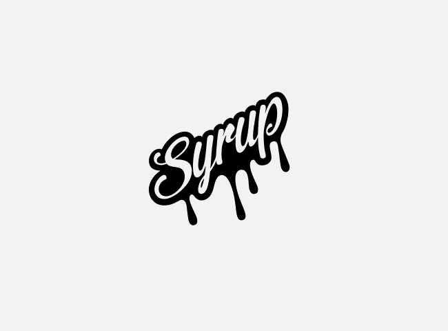
Our signature mark
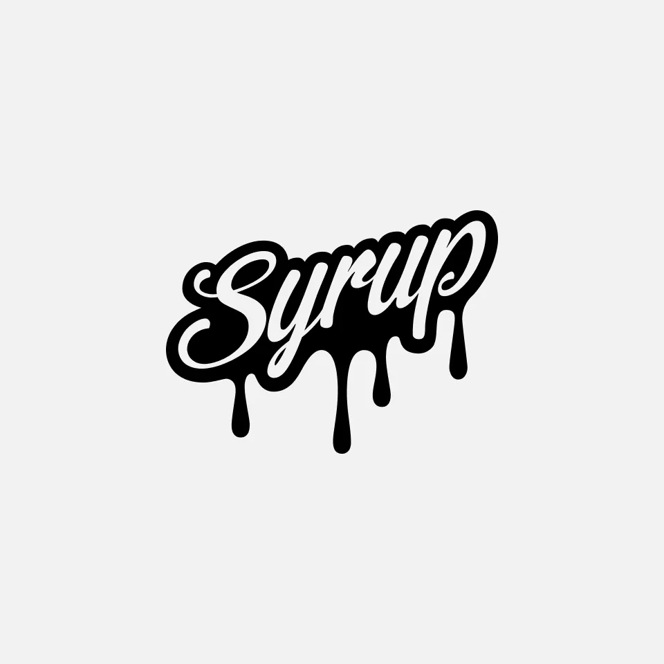
Our signature mark is the clearest expression of the Syrup brand. It’s designed to show up with confidence. It’s simple, intentional, and unmistakable as the Syrup name. Built for clarity at every scale, the mark holds its own across digital and physical environments without needing explanation or embellishment. When in doubt, this is the version to use.
Available formats
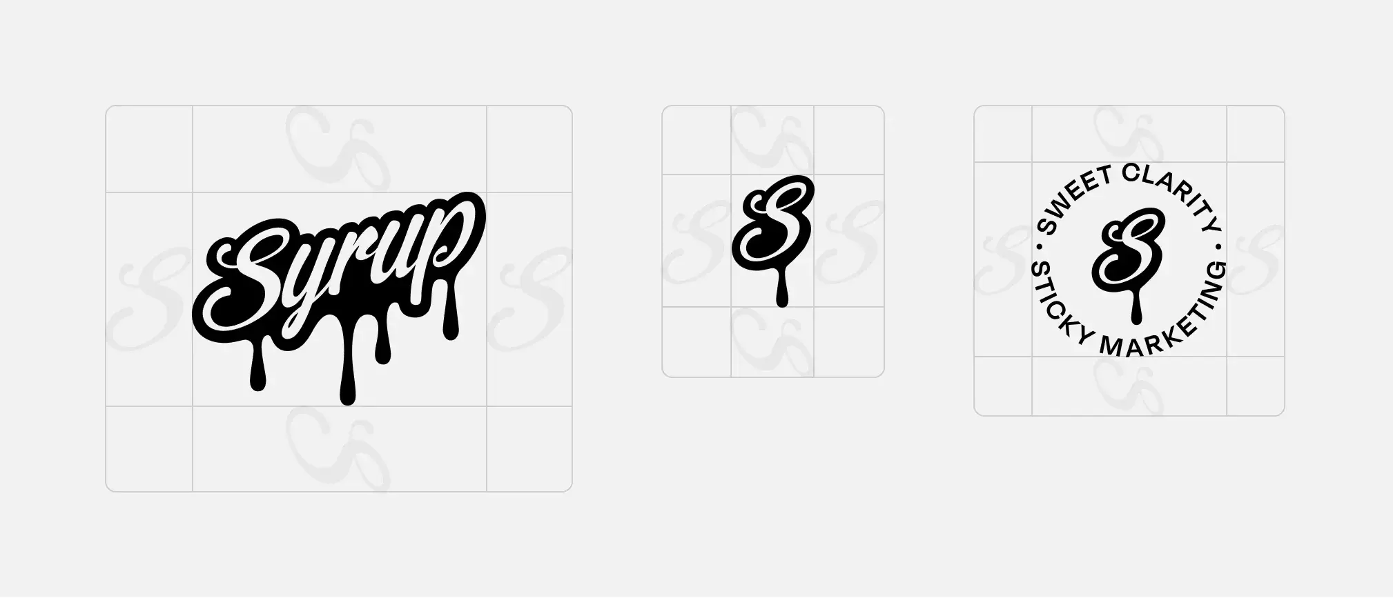
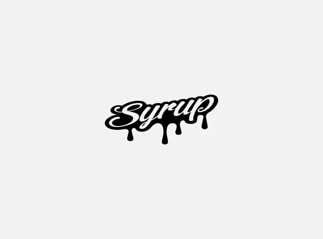
Syrup’s logo is available in three approved formats: the full Syrup wordmark as the primary logo, the “S” drip, and the Syrup seal. Each format is designed to serve a distinct purpose while remaining unmistakably Syrup.
To protect clarity and recognition, the logo should only appear in these approved variations. How the mark is brought to life across channels should always feel intentional and consistent. Limiting usage to these formats strengthens recognition over time and ensures the brand shows up with the same confidence everywhere it appears.
Primary Logo
"S" Drip
Syrup Seal
Logo clearspace
Every version of the Syrup logo should have room to breathe. Don’t crowd it up against other elements unnecessarily. Always leave about a S’s worth of space between the logo and any other elements on the page.
Minimum size
To ensure the Syrup logo remains clear and legible, each logo format has a minimum size requirement. The primary logo should never appear smaller than 0.5” wide. If space constraints require a smaller footprint, use one of the approved secondary logo formats instead.
The “S” drip should never be smaller than 0.25” wide, and the Syrup seal (S with tagline) should not appear smaller than 0.75” wide. These minimums protect the integrity of the mark and ensure it always shows up with the clarity and presence it was designed for.
.5”W
.5”W
.5”W
Improper logo uses
The logo must be used as is and should not be altered in any way. This means that you must not do any of the following:
Don’t change the logo’s color
Don’t position the logo on an angle
Don’t outline the logo
Don’t distort the logo
Don’t place the logo over busy backgrounds
Don’t display other elements within the logo’s designated clear space
Don’t crop the logo in any way
Don’t add special effects to the logo
Don’t use the logo within text
Logo colors
Syrup logos should always appear in black or white. Gradients, effects, textures, or color treatments should never be applied to the logo.
03.Key messaging
Usage
Syrup’s key messages are designed to anchor how we show up in the market. Our tagline, Sweet Clarity, Sticky Marketing, captures our belief that clarity is what makes marketing work. It should be used as a unifying line across brand touch points.
Our guarantee is a statement of accountability. It should be used deliberately, in moments where trust matters most, such as sales materials, proposals, and positioning conversations.
Both statements should always appear exactly as written, with confidence and restraint. When used well, they reinforce Syrup’s role as a focused, invested partner, not just another marketing agency.
Tagline
Sweet Clarity, Sticky Marketing
Guarantee
We guarantee the best use of your marketing capital.
04.Colors
Primary Colors
The Syrup color palette is intentionally minimal, built around three core colors - off-white, white, and black - to keep the brand clear, confident, and timeless.
Near-white
Near white brings a sense of calm and restraint to the Syrup brand. Its muted tone creates space to think and allows other elements to breathe, making it ideal for backgrounds and negative space where clarity and focus matter most.
Black
Black is bold, confident, and authoritative. It provides essential contrast and anchors our minimal design style, making it the primary choice for text, icons, and calls to action where clarity and direction are critical.
White
White embodies clarity, openness, and simplicity. It supports clean layouts and reinforces focus and precision, making it a natural choice for backgrounds and moments where the message needs to feel light and unobstructed.
Gradients
Gradients are used as accents and background elements to bring energy, movement, and a sense of fun to the Syrup brand. They add visual interest and dynamism without overpowering the message.
#FFAF03
#FF57A2
#12ECFF
#CB57FF
#FF57A2
#CB57FF
Colors behind the gradients
The colors behind Syrup’s gradients exist exclusively to power our gradient system. These colors should never be used as flat, standalone fills. They are applied strategically through gradients only, adding energy and expression while preserving the clarity and maturity of the core palette.
Used this way, gradients bring dimension and momentum to the brand without competing with content or overwhelming the message.
Hex:#FFAF03
RGB:255, 175, 3
CMYK:0, 35, 100, 0
Pantone:7549 C
Hex:#FF57A2
RGB:255, 87, 162
CMYK:0, 81, 0, 0
Pantone:212 C
Hex:#12ECFF
RGB:18, 236, 255
CMYK:54, 0, 8, 0
Pantone:319 C
Hex:#CB57FF
RGB:203, 87, 255
CMYK:42, 70, 0, 0
Pantone:252 C
Accessibility
Clarity only works if it’s accessible. Syrup’s visual system is designed to be readable and usable across devices, environments, and abilities. Our color palette and gradients are built to meet contrast standards, ensuring content remains clear, legible, and inclusive wherever the brand shows up.
Using our color
Syrup’s colors should always appear in gradient form, never as flat fills. Gradients are used intentionally as accent elements or backgrounds to add energy and motion without competing with the message. All primary content - text, content, and core UI elements - should sit on the foundational color palette of near-white, white, and black. This approach keeps communication clear, consistent, and mature while allowing color to enhance, not distract from, the story being told.


05.Typography
Overview
Typography is a core element for our visual look and feel. It delivers information with clarity and legibility, and giving character and personality to our brand. While our words are what we say, our typography is how we say it.
Primary
SemiBold
Degular Display is our primary font, used for headlines and moments that need presence. It brings personality and confidence to the brand while remaining clean and modern.
Get the fontSupporting
IBM Plex Sans
IBM Plex Sans is our supporting font, used for body copy, UI elements, and longer-form content. It’s highly legible, neutral, and reliable, designed to keep communication clear and easy to read.
Get the fontAccent
Degular Text
Degular Text serves as an accent font, used selectively for call outs, highlights, or emphasis where a subtle layer of character helps reinforce the brand without overwhelming the content.
Get the fontA closer look
Degular Display
Headline Typeface
For all key brand moments
Medium · Medium Italic
IBM Plex Sans
Supporting Typeface
For body copy
Regular · Medium · SemiBold · Bold
Italic · Medium Italic · SemiBold Italic · Bold Italic
Degular Text
Accent Typeface
For all key brand moments
Medium
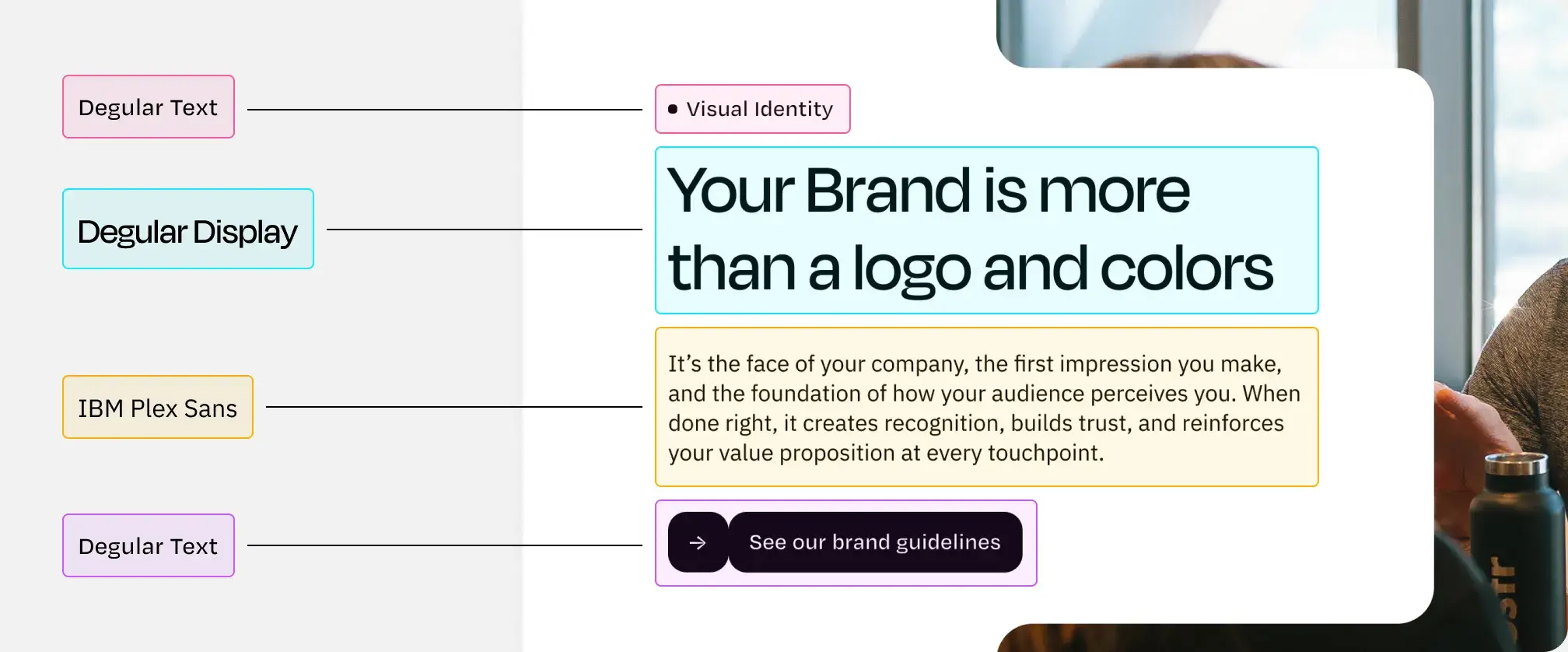
Typography in use
This example shows how our typography system works in practice, combining Degular Display, Degular Text, and IBM Plex Sans to create clear hierarchy and flow.
All headers and buttons use sentence case by design. Sentence case keeps our messaging human, confident, and easy to read. It reflects how Syrup communicates: direct, thoughtful, and grounded, across every touchpoint.
06.Photography
Subject matter
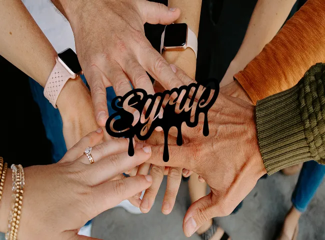
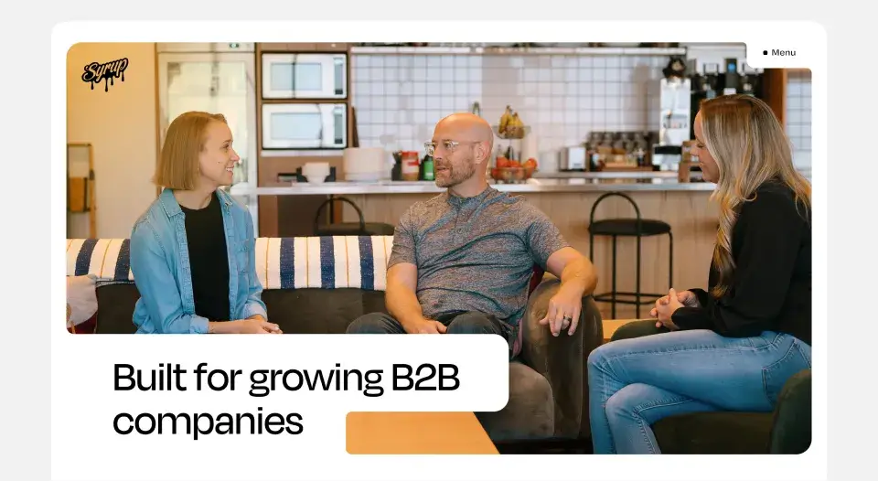
Photography brings life to the brand and should always highlight the collaborative culture of Syrup. All photography should be high-resolution and high-quality, reinforcing the confidence and professionalism behind our work.
Whenever possible, Syrup uses original company photography. In cases where stock imagery is needed, such as blog posts or select social content, it should closely match the look and feel of our own photography. Stock should feel natural, warm, and human, never staged, overly polished, or generic.
A great resource for photography that fits our brand: Unsplash.com


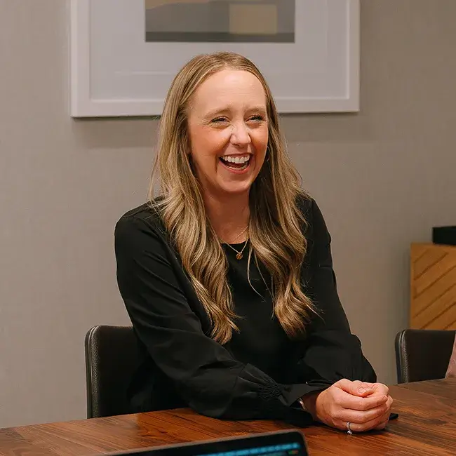
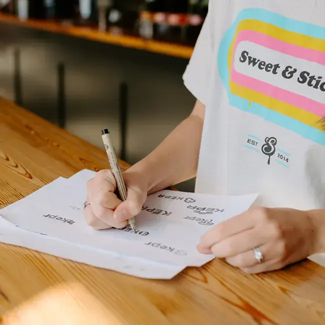


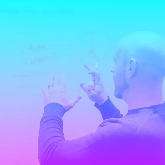
Image treatment
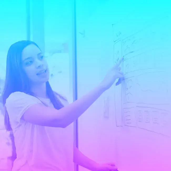
When photography requires treatment, apply a Syrup gradient overlay using the soft light blend mode. This approach adds energy and cohesion while preserving the natural clarity and integrity of the image. Treatments should always feel subtle and intentional, enhancing the photo, not overpowering it.


07.Elements
Logo animation
The Syrup seal is designed to animate and should be used as a dynamic brand element, bringing motion and energy to digital experiences without distracting from clarity.
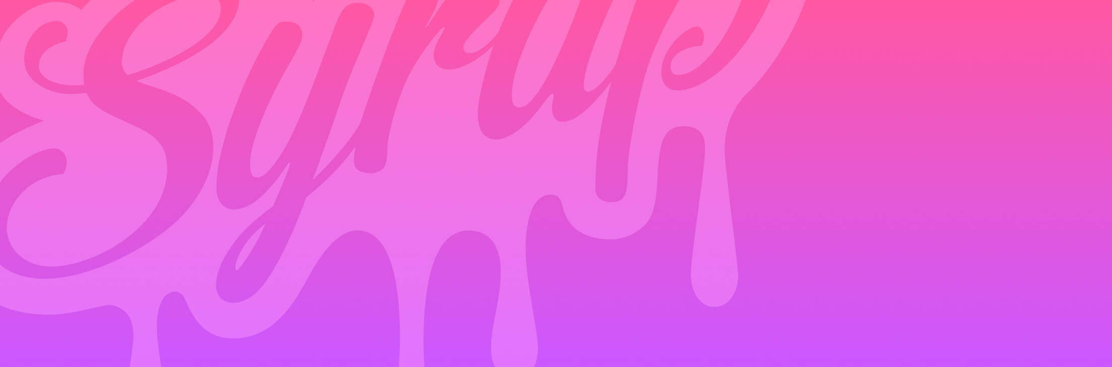
Logo graphic
The primary logo can be used as background element on top of gradients. In these cases, the logo should bleed off the page and be treated as a subtle visual layer, using the soft light blend mode at 50% opacity.
Fluid shapes
Fluid shapes are used as expressive brand elements and should be paired with Syrup gradients. When applied to photography or used as overlays, they should use the soft light blend mode to add movement and energy while preserving clarity. These elements should always feel intentional, subtle, and supportive of the content.
Elements in use
When applying visual elements to photography, Syrup treatments should use a gradient overlay set to the soft light blend mode. This approach adds energy and cohesion while preserving clarity and image integrity.