ViewFi
A bold brand launch for a first-of-its-kind platform

Visual Identity | Website
The challenge
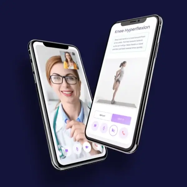
ViewFi was preparing to launch the first-of-its-kind healthcare application in the market, but they had no branding or positioning assets to communicate their uniqueness. They needed a clear value proposition, compelling use cases from doctors and patients, and a digital presence that would resonate with a highly targeted audience.
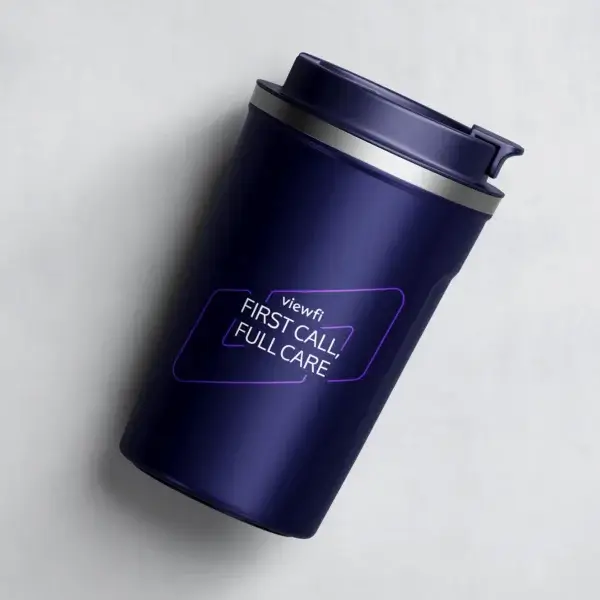
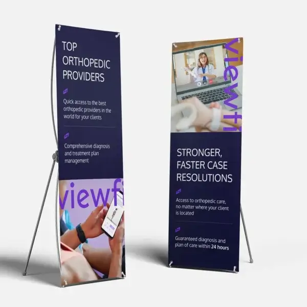
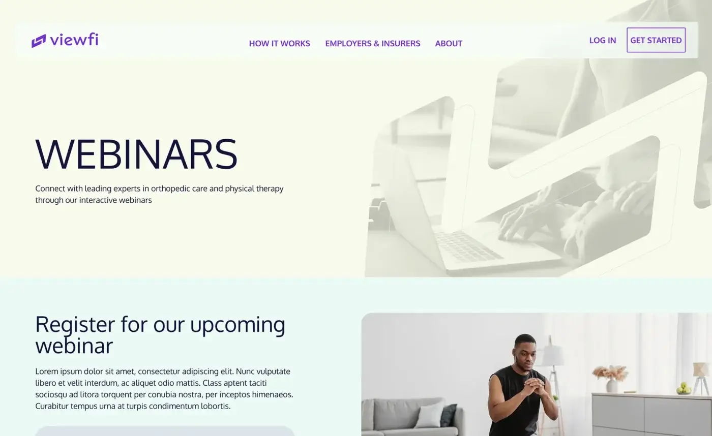
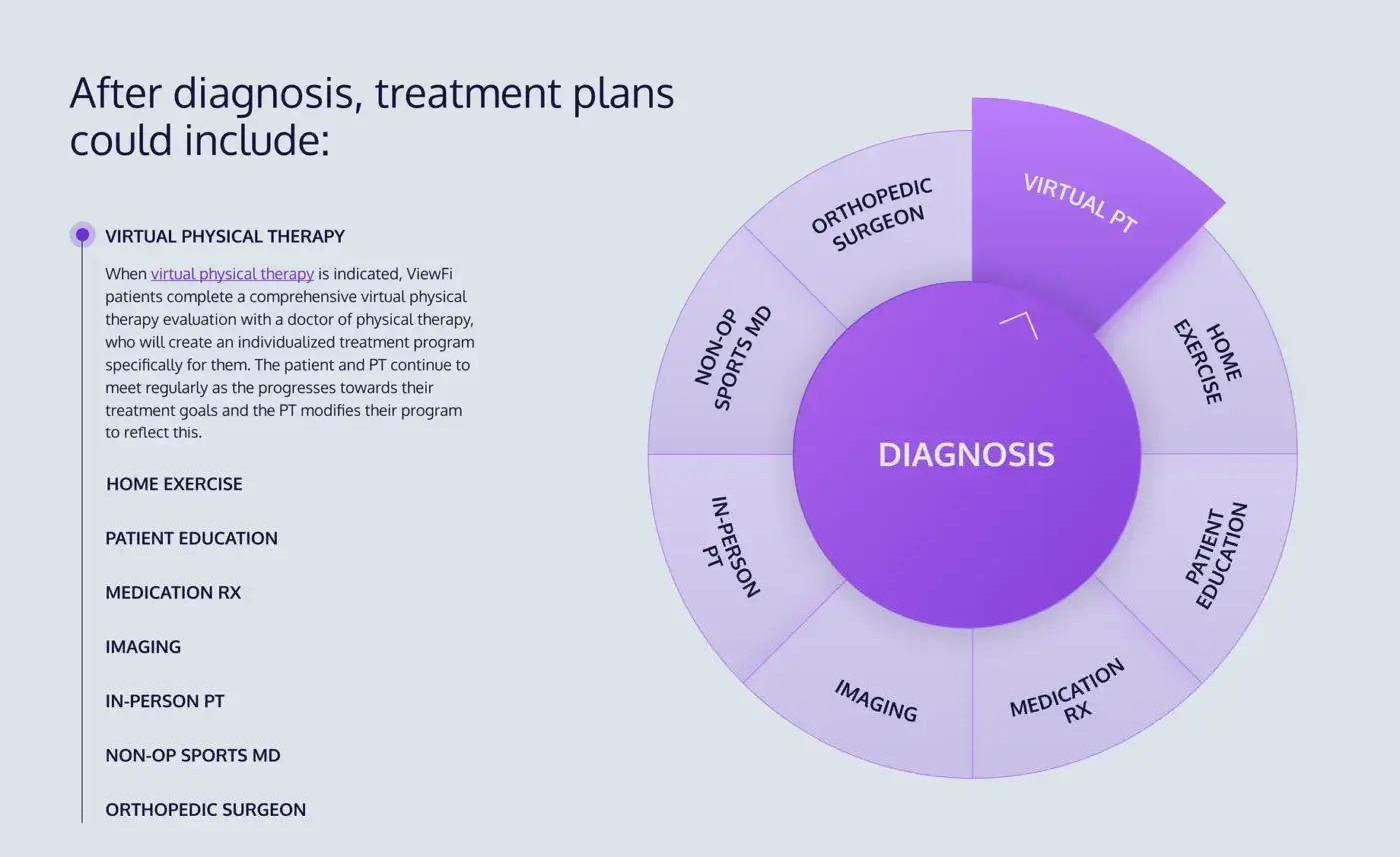
We developed their visual identity and first website, which served as the core sales tool to establish credibility, showcase how the application works, and validate their offering with early adopters.
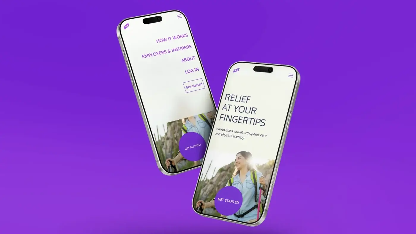
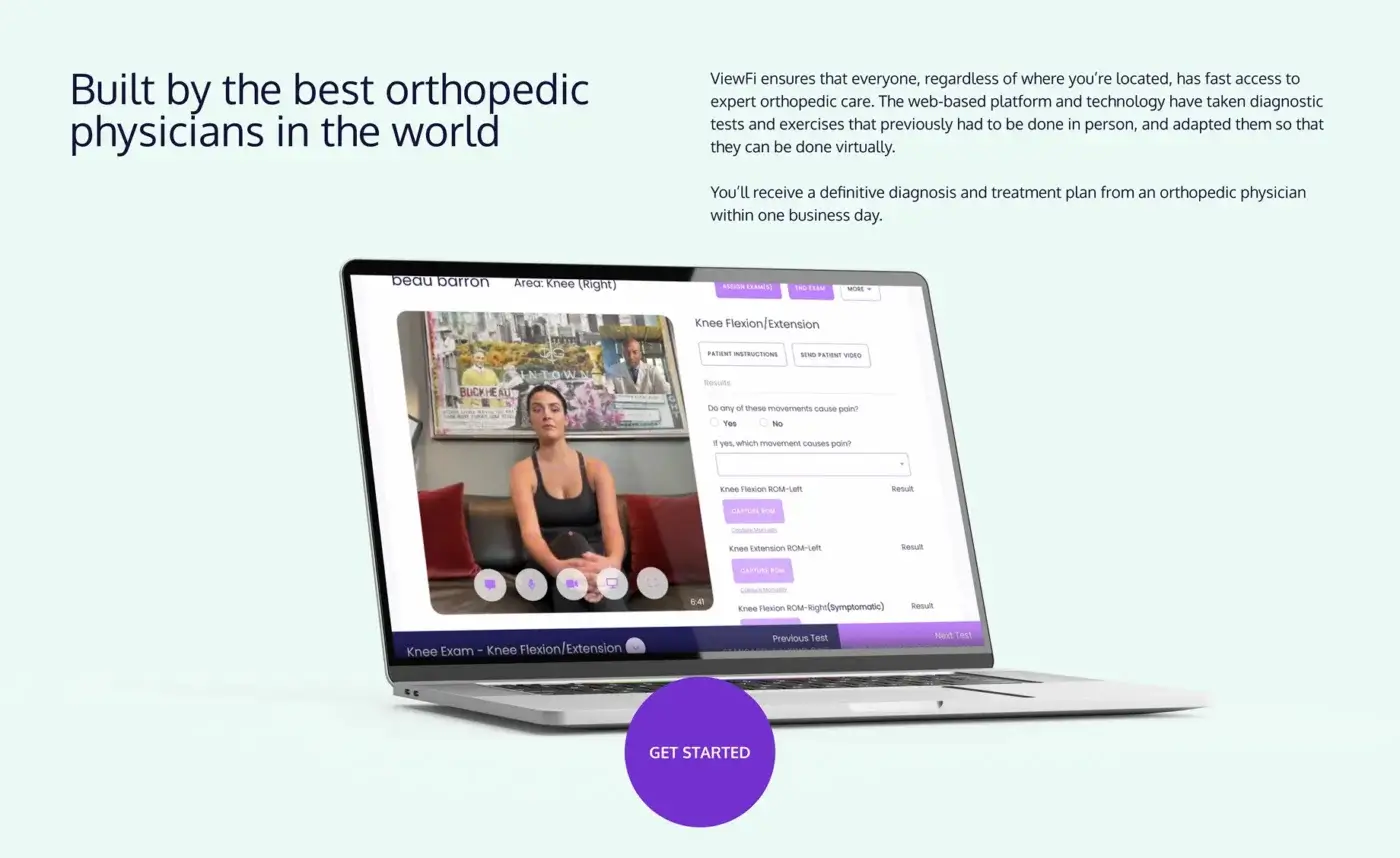
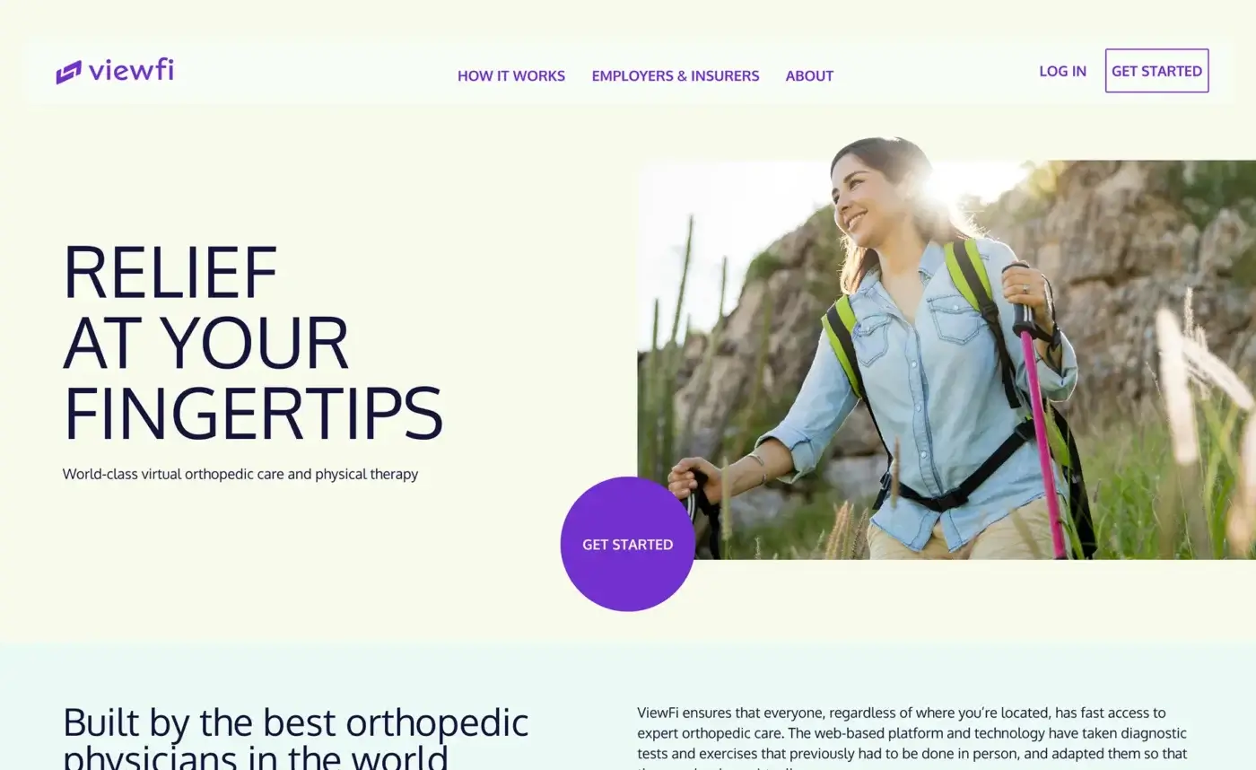
As their business grew and matured, that original website no longer supported their needs. The structure, content, and tools weren’t robust enough to match their expanded offerings or the sophistication of their audience. ViewFi needed a site that could continue to grow with them and position them as leaders in virtual orthopedic care.

The solution
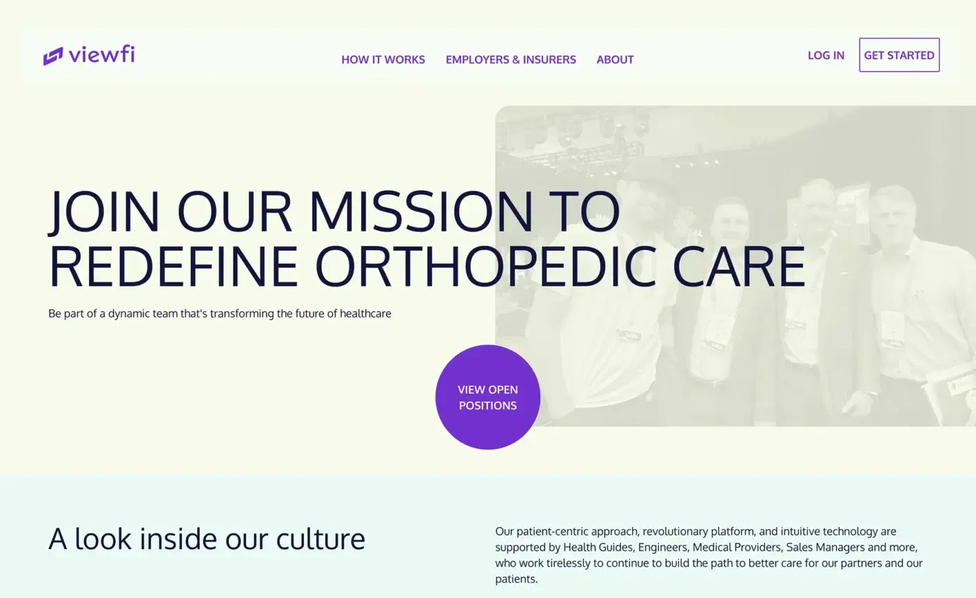
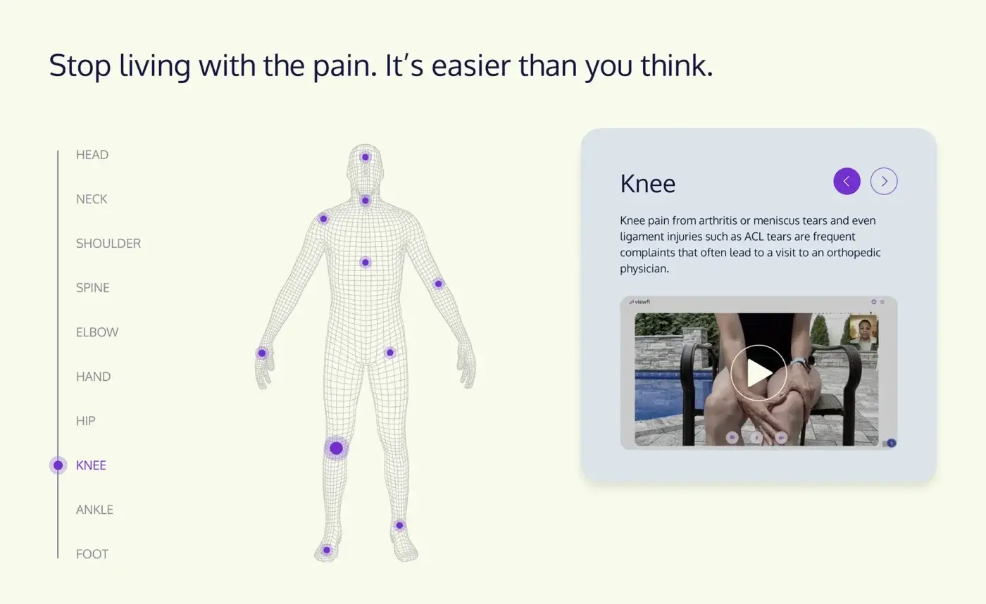
We partnered with ViewFi once again to design and develop a new website that reflected their evolution. Building on the foundation of the original launch, we created a more robust site that:
- Expanded site architecture to highlight new services and use cases
- Clarified positioning and messaging for multiple audiences
- Integrated validation tools like ROI calculators to strengthen credibility and drive conversion
- Evolved the look and feel to reflect a more mature, established leader in their category
The result is a digital experience that not only demonstrates how the application works but also establishes ViewFi’s authority and trust in the market, supporting their growth far beyond launch.
Before and After Comparison
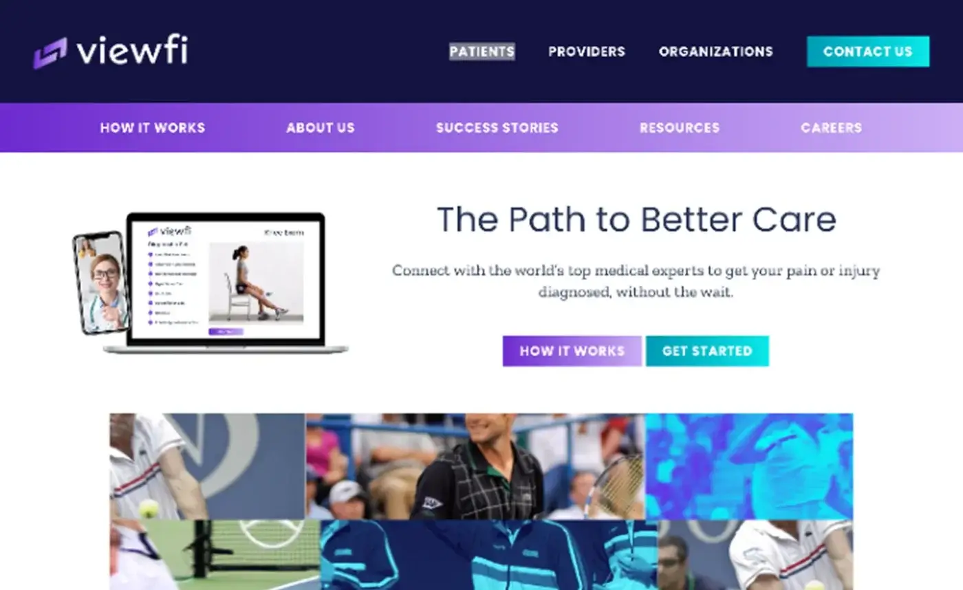
Before
After
Web stats
BeforeWeb Stats
- 64
Performance
- 81
Accessibility
- 93
Best Practices
- 77
SEO
AfterWeb Stats
- 90
Performance
- 100
Accessibility
- 100
Best Practices
- 100
SEO